London Dock Consultation - High Quality images
Key excerpts from the planning consultation for London Docks
I now have the PDF versions of the boards from the planning workshop last week, and have extracted key diagrams to save people having to download a number of PDFs. Having seen the presentations, I thought I might be able to add context with some annotations.
I should make it clear that I think St George are being very open and accessible in sharing information with the community, even if only for manipulating us! However, I find it a very interesting process.
1) Site strategies
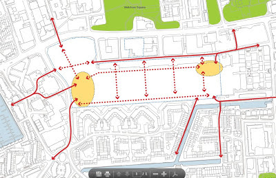
This map shows the intended flow of visitors around the site. Solid lines indicate routes to and around the boundary of the site, dotted lines indicate walking routes across the site. The north south lines run between the residential blocks. Interestingly, these suggest the need for a pedestrian crossing over The Highway closer to Ensign street - much like it was during the Olympics and possibly changes to crossings over the Vaughan Way.
Most controversial is the reinstatement of the pedestrian bridge over the canal in the south east corner - I imagine this may raise some planning issues with local residents around Waterman Way.
2) Zoning of open spaces
Water gardens are enclosed by the residential buildings - which are 'n' shaped from above, market gardens are structured walkways with foliage and greenery. Note the orange arrows correlate with sketches below (though I've ordered the sketches incorrectly)
3) Site access
Red arrows indicate pedestrian only, dotted red are access routes through the rum warehouse. Blue are potential vehicular and pedestrian entry. During the presentation they were keen to note there would be no through routes for vehicles.
4) Site plan with indicative use
The 'n' shape buildings are pretty much all residential, with commercial space on lower levels (squiggly drawings denote the broad use of the building other than residential). In order, the following diagrams are the whole site, followed by more detailed views from West to East.
Numeric labels are:
- Arrival square (open space)
- Quayside
- Water garden
- Market Garden
- Promenade
- Gauging square
See below for sketches of these
5) Indicative sketches of open spaces
Looking West from the waterside promenade towards Thomas More (I assume the tall building is the 38 storey tower). This suggests the water gardens are accessible, but that wasn't what I was told when I asked, though one might be accesible to the public
The 'gauging' square (note that this rhymes with ageing, not 'gouging' as some attendees pronounced it, giving it a more sinister feel!), looking south to Quay 430 - note obligatory water jets (not desirable when walking home and you need a wee!). This is hoped to be large enough to house an icerink. Comments made by St George suggest that there won't be as much water as suggested in the plan above.
This is the indicative drawing of a 'market garden'
This is the design of the walkway along the north of the site or 'quayside', note the water and bridges; rum warehouse runs along the left hand side.
6) The existing site - model
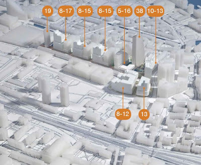
7) Proposed design - model and heights of buildings
Where a building is listed as 5-16 it means it varies in height from 5 to 16 floors.View from the north:
8) Building typologies
Twp of the forms of buildings potentially to be used on the sites. Note that the first few floors are in 'masonry' though not necesarily brick.
Source: London Dock Consultation, St George plc. Originals are available here


Comments
Post a Comment
Please leave a comment to let me know if you think I've got it totally or partially wrong!